Introduction
Disclaimer: I'm no printing expert. I made this guide after I got my own first inkjet printer to write down what I as a new printer owner wanted to know. I do know a thing or two about color management from other contexts though.
Why would you want to make your own custom printer profiles for your inkjet printer and papers? In most cases you can indeed find a manufacturer-provided profile, either from the printer maker or the paper maker. However those are often quite off both in terms of hue accuracy (more than 5.0 delta E average not uncommon) and also contrast and saturation (often exaggerated). By making your own printer profiles you can instead get a very good match with your calibrated screen with an average delta E less than 1.0. With a good screen to print match it's much easier to get exactly the look you want on your prints. Another advantage is that papers from different manufacturers will match up a lot better. It differs greatly between manufacturers how they "boost" their profiles and thus by using them papers will look much more different than they actually are.
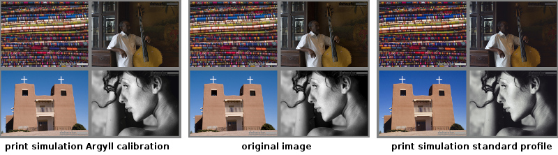
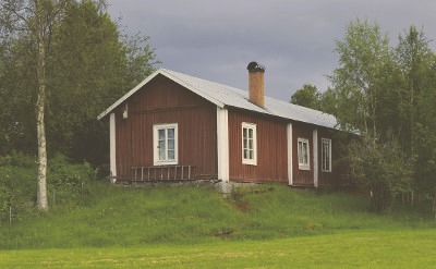
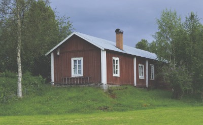
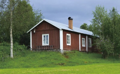
Demonstration of how well the original image (center) can be matched on print if you profile your printer (left), compared to using the manufacturer's bundled profile (right). This simulation was made using the actual profiles for a semi-gloss paper, and the impression does match the actual prints well, that is the calibrated is spot on (except for a little brighter black due to the paper) and the bundled profile is noticeably off. The bundled profile exaggerates contrast and saturation, and the hues are not really correct, most easily seen in the plain blue sky. The monochrome picture is also less neutral, and the stronger contrast kills shadow detail of the original image. The test image is a crop from a widely used printer test image made by Datacolor, you can download it at Northlight Images, which by the way has many great articles on printing. If you're viewing this page with an uncalibrated screen the differences can be hard to see.
In this article I will go through how you make a high quality profile using the cross-platform free and open-source color management software ArgyllCMS. If you already have a high end calibration software you're probably better off using that, and it's surely easier to use than Argyll, which is a flexible but complicated command line software. It's a complete color management system which can calibrate cameras, scanners, displays, and various types of printers, and the documentation can be hard to get into especially if you're new to color management.
With a tutorial like this it's quite easy to get through though, and correctly used Argyll will produce profiles that is just as good as those high end calibration softwares can make. A good profile in this context not only means accurate colors but also smooth gradients and neutral grays.
Even if you're not going to use Argyll you may find this article useful as it contains many answers to printer color management questions in general I had when I first got my printer.
The reason I use Argyll, apart from that I have a special interest in color management from an engineering aspect, is that I have a Colormunki Photo / Design spectrophotometer instrument (note: since the original release other products with the Colormunki name has been added to the range, this article is about the original spectrophotometer product). It's one of the more affordable instruments, and the while the instrument itself is good (although not as good as the highest end instruments) the bundled software is a bit simplistic. X-rite which makes it differentiates their products partly through software, and the Colormunki is meant as an affordable consumer package and thus the software is focused on simplicity rather than getting the best results. Results will still exceed manufacturer profiles in terms of accuracy, but not reach the results of the higher end software packages. Thus to lift the results you can use the Colormunki instrument together with Argyll.
Another reason to use Argyll is that you get more control and a deeper understanding of color management, and some users with higher end instruments and software still turn to Argyll for this reason.
How many patches do you need?
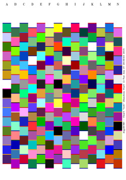
Argyll A4 sheet test target with 210 patches. Patch size is adapted to fit the Colormunki instrument.
The basic calibration workflow is to print a large number of color patches, measure them to see what the colors actually became, and then generate a profile based on the results which make appropriate translations so colors will match.
So how many patches do you need? Professional software use say 400 for fast profiling, 800 for medium quality and 1600 for high quality. Some choose to scan about 3000 patches, and sure if you have a high end automatic scanner there's no effort in going overkill. The Colormunki is however a manual instrument so scanning thousands of patches is going to be very testing on your patience. The Colormunki also needs larger color patches than high end spectrophotometers, so you would waste more paper and ink, and it also benefits from slower sweeps to improve precision. In other words, you don't want to go too much overkill with this instrument.
The consumer software bundled with the Colormunki uses a two-step process, where you first print a smaller selection of patches and measure them, which gives the software a rough idea of the gamut and will based on that produce an additional small set of refinement patches. Then you can reach a good result with much fewer patches, but you will always need to print two papers. The professional software generally doesn't use this method, but instead sample the whole gamut space in a single pass with as many patches as you like.
While Argyll does support "pre-conditioning" with a preliminary profile it's not really designed for a minimal two-step process, so you need to go with the single-pass method with a larger number of patches. Argyll's pre-conditioning is used to place patches where it counts the most, but you can't re-use the actual patches and measurement results from the preliminary profile.
For a specific high end print job you may want to really make sure that a specific set of colors are correct (for example a company logotype color set), and then you can make a profile just for that job by including those important color patches in your sheet when you calibrate. If you work at that level I would expect that you have a high end professional color management system and would not be reading this.
This article is about the "fine art printing" use case, where you do want predictable colors, but you don't have a need to go overkill on accuracy. It will be more important that the printer can do smooth gradients and neutral grays, have a predictable brightness and contrast than having the most accurate colors. The printer profiles here will surely not be far from the most accurate you can get, but if you do need the absolute best in accuracy you would get a professional instrument and all software that comes with that.
By measuring the same color patches several times I've noted that the Colormunki instrument varies about 0.5 CIE76 delta E on bright colors and 1.0 delta E in dark colors as it's more noisy in the darks, but if you use the more perceptually correct DE2000 it's about 0.5 over the whole range as the eye is less sensitive on dark colors. It's not much to complain about, but it does mean that we can't strive for sub 0.5 delta E profiles. Having some idea of how noisy the instrument is good to avoid going overkill on patch count.
So, how many patches do we need then? To answer that question I made a test, profiling the same paper (a cheap bulk matte paper) using 210, 420, 840 and 1680 patches, without pre-conditioning. I also profiled the same paper using the bundled Colormunki software which uses 50+50 patches in a two-step process (uses two A4 sheets). Then I checked how well all those profiles matched the measured 1680 patches.
| Patch count | average / 90 percentile / 99 percentile / max (DE2000) |
| X-rite 50+50 | 1.15 / 1.95 / 2.72 / 3.69 |
| 210 patches | 0.72 / 1.21 / 1.92 / 2.72 |
| 420 patches | 0.55 / 0.95 / 1.47 / 2.18 |
| 840 patches | 0.51 / 0.85 / 1.24 / 1.89 |
| 1680 patches | 0.45 / 0.74 / 1.16 / 1.50 (compared to own patches: 0.26/0.45/0.78/1.27) |
It's expected that the 1680 patch profile is good at matching its own patches, so instead I compared it to the gathered 840/420/210 set, but as some patches are the same the 1680 patch profile still get an advantage. Looking at the results we see that the more patches we have the better precision, and I'd say that for science it would have been interesting to have made yet another doubling to 3360 patches, but it would be 16 A4 sheets and more than an hour of scanning, so I skipped that.
It does look like the instrument is precise enough so you can do "high end" patch sets and actually get a measurable improvement. The cheap paper used in this experiment has a quite small gamut, possibly there would be larger differences on a larger gamut paper. I also skipped pre-conditioning in this test, and I would guess the smaller patch sets would have gained a little from that while there would be little difference in the 1680 patch set as the test grid is dense enough anyway.
So based on these results should we print 1680 patches, or even increase to 3000? Well, let's look at the actual numbers and apply some sanity. A modern inkjet printer is more linear than printers used to be, so even the simpler profiles have low delta E values. The truth is that if you print a real subject test picture with these profiles you won't be able to tell any of them apart. Only if you happen to print the worst matching colors and you can hold them up side by side, then you can see a difference. So in fact Colormunki's bundled software is certainly adequate, so you can skip over Argyll and stop reading now if you like.
However, there's a certain satisfaction and warm safe feeling just knowing that your printer profile has a very good color matching over the whole gamut, and the bundled software is cleary not as accurate as even the single A4 sheet Argyll workflow (210 patches), which arguably is even more comfortable and efficient as you only need to print one sheet of paper instead of two. So I think there is a case for using Argyll still.
Based on these results my recommendation would be to make single sheet profiles for more casual papers, and 2 sheets as the minimum for a profile with overall good accuracy, while 4 should be all you need. More than those 840 patches is probably overkill, but if you have time and patience for a special paper you could go further, but as seen in the testing there will be very little gain.
More patches is only about very slight improvements in accuracy, you won't improve smoothness (which will be good from the simplest profile). That is a profile made from fewer patches will not make a bad print, and if you like the result it's a good print. The only purpose of an accurate profile when you do fine art printing is to make color as predictable as possible so when you press the print button colors will come out as you have seen on screen.
There might be a micro-visible effect from how well the gamut boundary is sampled and modeled, I suspect the "better highlight detail" claim I've seen quoted on the net for large patch sets comes from there. With more patches the gamut boundary is traced more precisely and the profile might render one more tiny step before clipping. With a gradient test image I may have seen such an effect (could have been some side effect of roll off too though), and there 840 patches was needed to reach out to the limit.
This combined with the delta E measurement results and other user's experiences I've heard about was what made me come to the conclusion that 840 patches is a good balance for a high end profile. It provides some safety margin while not being overkill.
Argyll printer + paper calibration workflow
I assume here that you have Argyll installed and working with your spectrophotometer instrument. It can be a bit messy to install on Windows and Mac OS X, but if you just carefully follow the installation instructions available on Argyll's web site you should be fine. When doing this guide I'm myself actually running Argyll in Linux and print the generated TIFF files in Windows in a virtual machine. You could do the other way around of course too, run Argyll on Linux in a virtual machine on Windows if you like. An advantage of that is that Argyll is available directly in the major Linux distributions and you don't need to mess with drivers.
This workflow description is quite long and detailed, if you're already familiar with Argyll you can skip to the workflow summary.
1. Start the a command line terminal, create a working directory and move there. All Argyll intermediate files and output will be in this directory.
2. Generate table of test target color patches.
First choose if you're going to use pre-conditioning or not. I
recommend using pre-conditioning as it makes
Argyll's test target generator command targen focus on
the neutrals more and other colors where the eye is more
sensitive. This means that you must already have a profile for this
printer + paper combination, or a similar paper. Don't worry if you use
a profile from a similar paper rather than the
same, targen only needs a rough idea. The paper
manufacturer often has profiles for the paper you can use, or you use
a profile you have made yourself earlier.
Below are a few different patch counts (-f) to choose from (adapted
for Colormunki on A4 to fill even pages), each one has some extra gray
patches (-g) for higher precision black and white.
targen -v -d2 -c <precond.icc> -G -g8 -f210
    <name>
a single A4 sheet, still more accurate than Colormunki's bundled software
targen -v -d2 -c <precond.icc> -G -g16 -f420
    <name>
2 A4 sheets, if you can't decide this is a good number
targen -v -d2 -c <precond.icc> -G -g32 -f840
    <name>
4 A4 sheets, likely "as good as it gets", more is likely overkill
targen -v -d2 -c <precond.icc> -G -g64 -f1680
    <name>
8 A4 sheets, probably overkill
targen -v -d2 -c <precond.icc> -G -g128 -f3360
    <name>
16 A4 sheets, definitely overkill, very tedious to scan manually
If you don't want pre-conditioning, simply remove the
-c precond.icc parameter, there will still be some extra
focus on neutral thanks to the extra gray patch array (-g). There is
certainly not a big difference between profiles using pre-conditioning
or not, especially if you use a high patch count. However, as one
today nearly always has a profile to start with (the manufacturer's)
one can add it without effort. If you really have to make a your own
preliminary profile, I would skip over it.
Note that the single sheet profile will still produce a good result, more patches is really only fine-tuning. Say if I'd buy a single pack of paper of only 20 sheets or so, I would only spend one sheet on profiling. The higher patch counts are for papers you will come back to and print over and over again. The one sheet profile is also good for sample packs where you often get two sheets of each type, then you could profile on one sheet (preferably with pre-conditioning using the paper maker's profile) and print a known test picture on the other for evaluation.
The <name> parameter is a filename which is used throughout the workflow.
If you already know what the profile filename should be you set that
name here (excluding the .icc suffix), but it's okay with a
temporary filename too and rename later.
ICC files may have .icc or .icm suffix, here .icc is used throughout
but you can put in .icm instead where needed.
If you're not printing to A4 sheets you must find out how many patches
that fits to one sheet of your size through trial and error (change
the -f parameter). Argyll adapts and optimizes color patches
automatically to any given patch count.
3. Generate TIFF files for printing from the test target table.
printtarg -v -iCM -h -R1 -T300 -p A4 <name>
The above command line is made for half-size Colormunki (-iCM -h) and
A4 size (-p A4). If you have a different instrument or other page
size, change those parameters.
4. Print the test target page(s) and let them dry.
When you print make sure that the printer driver is configured correctly, that is select appropriate media type to match the paper and disable color management. It's also important that your printing application doesn't do any color management. Some applications will always apply color management (such as Adobe Photoshop), so if you're unsure you can download and use the free "Adobe Color Printer Utility".
chartread -v -H -T0.4 <name>
6. Generate profile, this can take several minutes, or even hours.
colprof -v -qh -r1.0 -S AdobeRGB.icc -cmt
  -dpp -D"<description>" <name>
or if it will only be used with relative colorimetric rendering intent:
colprof -v -qh -r1.0 -D"<description>" <name>
You need to have the AdobeRGB ICC profile in the same directory or
point it out elsewhere. The purpose of providing that is so the
perceptual (and saturation) rendering intents know which color space
to map from. It has no effect on relative and absolute colorimetric
intents. If you can live with that perceptual and saturation intents
works the same as relative intent you can skip -S AdobeRGB.icc -cmt
-dpp, which will also make the profile generation much quicker. It's a
limitation of ICC profiles that the perceptual intent cannot adapt
automatically to the color space of the image being printed. AdobeRGB
is however a good all-around choice and gives okay results even if the printed
image would be for example sRGB.
The perceptual gamut mapping procedure also needs to know which
viewing conditions it's optimizing for: -cmt means the source is a
monitor in a typical working environment (that is your photo
workstation where you edit images before printing), and the
destination -dpp is reflective paper (that is the print paper).
I'm personally not a big fan of the perceptual rendering intent as the rendering depends so much on the profile's "subjective" optimizations, while relative colorimetric is more well-defined and simpler to understand, so I often skip the perceptual parameters as I will only print with relative colorimetric intent.
The description should contain something that makes the profile easy
to identify, typically a string of which printer and paper it was made
for, and perhaps add something so you can see it's one you made. Example "Canon Pro-1 / Canon Photo Paper Pro Luster
(Custom)".
The -r1.0 parameter increases the averaging from the
default 0.5 to 1.0, and will thus make up a smoother profile (smoother
gradients) but a little bit less accurate. From tests made I've found
that 1.0 can improve smoothness while losing very little accuracy. If
you think accuracy is more important you can drop this parameter.
7. Sanity-check profile, by matching the profile with the measured patches.
profcheck -k <name.ti3> <name.icc>
If there was no measurement errors, you printed on a good paper with a modern inkjet printer the DE2000 average and max errors should be less than say 1.5 and 3. If the max error is large there was probably some problem during measurement. If you want to you can further evaluate profile performance, but the Argyll with this workflow is generally so robust so it should not be needed.
8. We're done. Rename the ICC file to a suitable name, install it and start using it.
Workflow summary
If you've done Argyll printer profiling before, here's a copy-paste list of commands:
  targen -v -d2 -c <preconditioning.icc> -G -g32 -f840 <name>

  printtarg -v -iCM -h -R1 -T300 -p A4 <name>

  chartread -v -H -T0.4 <name>

  colprof -v -qh -r1.0 -S AdobeRGB.icc -cmt -dpp -D"<description>" <name>

  profcheck -k <name.ti3> <name.icc>
Black and white printing
I rarely print black and white prints and I have not yet deeply investigated that aspect of printing. If I would get into black and white printing I would do some further research in addition to what I've made for this article.
What I do know is that in the base case of black and white printing you use the standard ink set and a profile which is well-tuned for rendering neutral black and white. The printer will not only use the black and gray inks, but mix in an amount of other colors to tune the white balance so it becomes more neutral than it otherwise would have been.
The profiles generated here are tested for their performance in black and white and have some optimization steps taken to make very neutral prints so it should work fine, but I would still like to look even deeper into best practices to see if there are any further recommendations or information to share. Perhaps in a later revision of this article.
Why an RGB profile?
You may have noticed that the ICC profiles we generate provide RGB rather than CMYK output. Why is that?
A modern pigment inkjet printer is not a straightforward CMYK printer, they have many more inks to expand the gamut, make finer gradients and work over a wide variety of paper types. Ideally the profiling software should be aware of the ink set and be able to control them individually. However, this is generally not the case so what you do is that you profile the printer + paper + driver as a whole and calibrate it as an RGB device.
As the typical use case is to print photos which are stored in an RGB color space this makes sense. When looking at older documentation found on the net you may become doubtful of this method, but I think it's safe to say that today it's "best practice", and in fact the printer driver does not allow any other way. A modern inkjet printer is also more linear than older printers were so it's easier to calibrate ("linear" means that the printer color is well-behaving and predictable, so if you calibrate with fewer color patches it's still likely that the in-betweener patches left out will match).
Measuring test targets
With Colormunki you manually drag the instrument over the strips of color patches. The instrument is designed for reading few large patches, but when you make test sheets for high quality profiles you need to scan lots of patches and then you want to print them as small as possible.
Using homemade custom rulers some DIY enthusiasts have read as small as 7mm wide patches, however there are indications that the read precision is affected negatively with such small patches. To be on the safe side I use Argyll's default CM halfsize which is about 14mm. The Colormunki instrument is a bit noisy on dark colors, so it's likely an advantage to make each sweep quite slow so each patch get several probings that are averaged. When you sweep slow you will not need any ruler as guide.
Paper white is also measured and to be on the safe side it's recommended to have one or two sheets of unprinted paper underneath the test target to avoid any traces of see-through, unless the paper is very thick.
A more expensive instrument can read smaller patches and comes with an XY-ruler so reading is quite fast. With the Colormunki reading hundreds of patches will be a test of your patience. It takes about 4 – 5 minutes to scan an A4 sheet which fits 210 patches.
You can sweep the rows in both directions, Argyll will automatically figure out in which direction the sweep was made. If your paper is well-anchored this will speed up scanning a little, but if you only anchor one side scanning from one side is easier. You start and end a row scan outside the patches, on paper white. Even so Argyll won't measure paper white there, so the test target will contain white patches.
There are a couple of caveats. Be very careful when you scan, you can get a bad row scan and Argyll may silently accept that and then your profile will suffer. You'll notice this through a very large delta E error in the profcheck step. Unfortunately Argyll has no good method to detect where the error is and reread the failed ones. In one case I had a read error on a 1680 patch profile. With the help of the profcheck tool I found out that it was one row that was bad, I re-read that in a separate file and then used a text editor to merge with the original, and then regenerated the profile. The alternative had been to start over and scan all patches once again. During my testing period when I've scanned many many sheets I only got this error once though, so it's not that likely to happen.
Another issue I've come across is that the automatic row detection can make mistakes, it's rare but it happened once in the 1680 patch set that Argyll thought I was reading a different row. Argyll allows you to override though, so when it complains, double check that you're reading the right row and if you do, override.
Argyll is a little bit sensitive, so try to sweep smoothly. It's normal to get "failed to read row" once in a while especially the first few times you scan, and then you just retry that row.
The Colormunki instrument has rubber feet on one side. Those can be very irritating when you sweep as it affects the glide, so I recommend to cover them with thin tape.
Evaluating profile performance
I evaluate profile performance with the following steps:
- Check how well the profile maps to the measurements made during profiling.
- Run the profile through a diagnostic test image to check for possible bad gradients.
- Print a well-known test image with real subjects and compare with on-screen and relate to previous experiences.
The first step is the basic sanity check, to feed all the test patch colors through the profile and see how well the result matches the actual measurements. This may see like a strange thing to do, shouldn't the profile match the patches exactly? No, the profile generator needs to take things like smoothness and measurement noise into account so there will not be a perfect match.
Below you find commands for testing how well an ICC profile matches the
measured patches, result in DE2000. With -v2 all patches
are listed. If on Linux or OS X you can pipe the output
to sort to get the patches ordered from best to worst
match.
profcheck -k -v measurement.ti3 profile.icc
profcheck -k -v2 measurement.ti3 profile.icc
profcheck -k -v2 measurement.ti3 profile.icc | sort
If the profile passes this test it's very likely that's it's all good, so you don't need to test further if you don't want to.
If we continue testing the next thing to evaluate is smoothness, that is how smooth gradients are printed. You can do this without printing at all, by generating print-ready TIFF-files from a test image:
timage -x -g 0 test-image.tif or
timage -x -t -g 0 test-image.tif
tifficc -v -w16 -t1 -b -i AdobeRGB.icc -o printer_profile.icc test-image.tif print-image.tif
If there's huge clipping (small gamut on paper), you can reduce the
saturation in the test image by mixing in more percentage gray (-g
0-100), or use a smaller input color space, sRGB instead of
AdobeRGB for example. The above conversion command uses LittleCMS
tifficc in relative colorimetric mode with black point
compensation. You can also test other rendering intents. Instead of tifficc
you can use Argyll's cctiff — see the section
on soft-proofing for further details how
to use these tools. The timage command can render more
types of images, run it without parameters to see alternatives.
The transition to the clipped areas (to black and out of gamut) will often look rather sharp and irregular, this is normal. What you should look for is irregularities in the in-gamut areas. Note that it's quite common that a calibrated screen has issues with banding, so it may be a good idea to turn off screen calibration when evaluating gradients.
I shall confess that it can be difficult to draw any conclusions from
these test image renderings, it's hard to realize if you see a problem
or if it's just gamut clipping. One method that has worked for me is
to generate an extra version of the profile with strong smoothing,
increasing the -r1.0 parameter to -r4.0 when you run colprof, and then
run that profile through the same images and see what the differences
are, if some bump somewhere disappeared with the strong smoothing
maybe there's some problem with the profile.
Finally you should print some well-known test image. I think it's best to keep to one all-around image that covers many aspects. By always printing the same image you get used to how it should look and what to look for. Over at Northlight Images you can find links to some good test images and tips of how to evaluate the results both objectively and subjectively.
Target generation details
Argyll's targen command has many parameters and you may be tempted to
spend hours to find the "best" target. To save you some time I can say
that the default spread is already very good and it will be only very
marginal differences if you change it.
However, if you still want to experiment you need a VRML viewer so you can visualize how the patches are spread in space. I use view3dscene.
To render a default spread the command is:
targen -v -d2 -G -w -W -f<patch count> test
Then you can visualize the result in device space
with view3dscene testd.wrl, and in Lab space
with view3dscene testl.wrl.
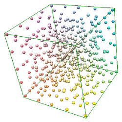
420 RGB color test patches distributed in the device space RGB gamut cube, as shown via Argyll's generated VRML file. White is the closest corner. Here pre-conditioning has been used so there are higher patch concentration closer to the neutral axis, and we've manually added an array of gray patches.
The targen command differs between device color and perceptual color. Per default it
spreads the patches relatively evenly in device space, each patch is
about the same distance away from any other patch in terms of RGB
values, which is easily seen in the device space VRML file. However,
you could say it's better use of patches if you space them equidistant
perceptually, which would mean larger device distance in saturated
greens where the eye is less sensitive, and smaller device distances
close to neutral colors.
The problem is that to actually model the perceptual distance
accurately you need to know what actual perceptual colors the printer
will generate, and for that you need a printer
profile. The targen command thus
allows providing a printer profile for "pre-conditioning", which is
used for figuring out perceptual distance. For this you can use a
previously generated profile which can be a minimal one as targen
needs only a rough idea of the device behavior. It can even be a
profile for a different paper as long as it has similar properties
concerning contrast and saturation. For example if you're profiling a
matte paper you can use a profile from a different matte paper.
Don't enable a strong perceptual weighting (-A parameter) without
having any profile though as the default device model assumes a very
saturated high contrast paper and can render rather odd patch
spreads.
If you do provide a pre-conditioning profile, targen will weigh in
perceptual distance to a strong extent when deciding distance between
patches.
I've experimented quite a lot with targen, and I ended up with the
conclusion that the only optimization worth doing is to use
pre-conditioning, and add some extra gray patches to get some further
focus on neutrals. I've found no reason to change the default
weighting parameters.
On the net you often find recipes where there are a much larger
number of neutral gray patches added than I have in
my workflow (controlled by the -g parameter). The intention is to render black and white as neutral as
possible. However, while it may help to put in some extra there most
recipes I've seen go overkill and seem to forget that the calibration
process needs to find the actual neutral which can be some distance
away from the gray patch. Therefore I think it's better to not have
that many gray patches and instead use pre-conditioning to concentrate
more patches close but not at neutral.
Display calibration and print viewing
The display can also be calibrated using Argyll, and if you have a Colormunki instrument like I do I would recommend to use Argyll as it will most likely give you a higher quality profile than the bundled software will. See my display calibration article for a workflow description.
A common combination when working with prints is to calibrate the screen for 6500K and view the prints under 5000K. Why not the same temperature on both? It seems like the difference in medium require different temperatures. A back-lit screen needs a bluer white to look white than a reflective print. If you set the screen to 5000K it will look overly yellow, the combination of 6500K screen + 5000K print has simply proven to give a better perceptual match. The theory behind this is that the eye/brain only makes a partial chromatic adaptation if the medium is emissive with a peaky spectra like a screen, and thus the screen needs a higher temperature to match a broad spectrum reflective print.
Some do set their screens to 5000K anyway though so it's a matter of taste, but the de-facto standard is 6500K + 5000K. Note that most uncalibrated consumer screens are rather blueish (9000K or so) so a 6500K screen may look a bit yellow before you are used to it.
Remember that the goal is that you should be able to fine-tune color on the computer and then print and get a predictable result. There's no value in matching white points just because you can, if it's not contributing to making your print color more predictable it's not providing any value.
The typical standard light for print viewing is a 5000K high CRI lamp, which roughly corresponds to outside daylight. These can be quite expensive and while it's good to have one eventually you don't need to rush. The eye is very good at adapting to different viewing conditions, so ordinary indoor light is generally good enough to make print evaluation with sufficient precision for fine art printing. Fine art prints in a home environment are generally displayed in a variety of light, from regular indoor lights to outdoor light coming in from the windows, so in a way evaluating the print under a typical home light can be more relevant.
The 5000K viewing lamp is a good reference to use for a print that is going to be displayed in various lights, and it makes screen/print A/B comparisons a little easier to do so I still recommend to get one at some point.
Which rendering intent?
Printers + papers have a smaller gamut and smaller dynamic range than a photo and a screen can represent. For colorful saturated images with high contrast it's not unlikely that the printer cannot produce as saturated colors and as dark shadows as the image contains.
Then what? ICC profiles have rendering intents, and for photography there's mainly two of interest, "perceptual" and "relative colorimetric". The perceptual intent will reduce the dynamic range of the image and reduce the saturation in it until it fits in the printer's gamut. The image may look flatter than on the screen but all colors and shades are there. There is no standard how this conversion should be done so not all ICC profile makers do it in the same way but typically in-gamut colors are changed as little as possible with a compression towards the gamut boundaries.
The perceptual rendering is controlled by a static conversion table in the ICC profile, and a problem with that is that there has been an assumption of what the source color space is. This assumption is typically AdobeRGB, but if you instead pass an image with a different color space such as sRGB or ProphotoRGB the output will differ slightly. There is no tag in the ICC profile that says what the perceptual intent expects, so the printing application cannot know. As the difference in look generally is minor and perceptual is used in more casual contexts this is however not a big issue.
Then there is the relative colorimetric intent. It produces all in-gamut colors accurately and clips the rest to the gamut boundary. That is if a color is too saturated it clips it to the maximum saturated color the printer can make, and if a shadow is too dark it clips it to the darkest color the printer can make on the given paper. If you don't want the shadow clipping to happen (which kills shadow detail), you enable "black point compensation" which then causes the shadow range to compress towards the black point instead of clipping and you keep the shadow detail just as for the perceptual mode.
Black-point compensation (BPC) is not a feature of the ICC profile but of the printing software, first introduced by Adobe in 1998. Due to Adobe's dominance it became a de-facto standard and they published the algorithm in 2006, and in 2013 a highly similar algorithm was up for standardization (it's that one which is available in Little CMS). I'm not sure what the exact status is today, but I think one can assume that BPC today works almost exactly the same regardless software. Some software always enable BPC without providing an option to the user, like Adobe Lightroom.
Perceptual mode is most "user-friendly" and good for casual printing, it will generally always look good. I think the best method when making high end fine art prints is to avoid using more saturated colors than the printer can make in the first place though, and then you can print in relative colorimetric mode whose behavior is more well-defined. Limiting the shadow range to fit the target gamut is much less practical though so instead one enables black-point compensation.
Few printing softwares today make a really sharp clipping towards the gamut boundary but instead makes a soft roll-off similar to perceptual rendering. This means that relative colorimetric with black point compensation often works well also in images with out of gamut colors, and you can use it almost like perceptual rendering, especially on papers with a larger gamuts (semi-glossy or glossy papers).
Even if relative colorimetric is exact in many ways, the appearance of a screen and paper differs so much that you should expect to make some manual trial-and-error adjustments specifically for the print if you print a high contrast image on a low contrast paper.
Note that if the image doesn't have any out of gamut colors and black point compensation is enabled the relative colorimetric result will be very similar to perceptual rendering, but as relative colorimetric is not dependent on any source color space assumption it will render more exact and is generally the more predictable choice, and therefore better I think.
Both perceptual and relative intents adjust the white point to match the paper, in other words adjusting "white balance" so that the the white point matches the naked paper. Paper is generally more yellow than the screen so all colors will then be printed with a more yellow tone compared to the screen. This will not be seen as a yellow cast though as the eye adapts to the white point of the media.
With "absolute colorimetric" intent the profile makes no such adjustment thus the brightest white will not be paper white but instead tinted, which doesn't make up a good print. This intent is useful for paper simulation in soft-proofing but not for printing.
Too summarize — for casual printing perceptual rendering intent is fine as you don't need to care about what gamut the printer has, while for well-defined and serious printing relative colorimetric intent with black point compensation enabled is better. On wider gamut papers relative colorimetric can produce better results than perceptual rendering even if there are out-of-gamut colors. If your print software doesn't allow you to enable black point compensation it probably means that it's always on.
Generating TIFF files for printing and proofing
Original image

Converted with a matte paper ICC profile using relative
colorimetric with black point compensation. This is the RGB
data sent to the printer driver. The darker colors and higher
contrast compensates for the low contrast paper. Command:
tifficc -v -w16 -t1 -b -o printer.icc input.tif
      print.tif
Converted the printer image backwards to screen to
simulate the paper look (soft-proofing). As we use absolute
rendering intent the paper white is also simulated, which looks
yellow when presented on screen. Command:tifficc -v -w16
-t3 -d1 -e -i printer.icc -o*sRGB print.tif proof.tif
Soft-proofing as above, but with white-point adaptation
simulation, which gives a more realistic view on paper
white. The image is still low contrast which simulates the paper
contrast. Command:tifficc -v -w16 -t3 -d0 -e -i
printer.icc -o*sRGB print.tif proof.tif
...or directly from original image:
tifficc -v -w16 -t1 -b -m3 -d1 -e -p printer.icc -o*sRGB input.tif proof.tif
Converted the printer image backwards to screen with
relative colorimetric intent with black point compensation,
which perhaps provides the most realistic view of how the print
appears under a good viewing condition. It looks almost exactly
the same as the original image. Command:
tifficc -v -w16 -t1 -b -e -i printer.icc -o*sRGB print.tif proof.tif
The typical use case when printing is to print from a color-managed software which will do the color conversion. However you can also do that using Argyll (or LittleCMS as we shall see) and make a TIFF file ready to be sent to the printer straight through without any further color management. Even if you will not have that workflow in production it can be interesting to see what happens "under the hood". It's also useful when doing profile evaluations as issues concerning smoothness or highlight transitions is easier to see on screen than on print.
Argyll's command line tool for this is cctiff, but I recommend to
also get Little CMS's tool tifficc (named tificc in some Linux
distributions).
Little CMS is another
well-known open-source project for color management. It's a color
management library used in many open source and commercial CM-aware
applications, so it's usually of more interest to software developers.
However with the distribution there comes a few command line tools,
and one of them is the the tifficc tool. It does the same thing as
Argyll's cctiff tool, but with the added feature that its relative
colorimetric intent supports black point compensation and have a
little roll-off to highlight clipping, just as the commonly used
printing applications behave today.
Argyll's relative colorimetric intent will clip out of gamut colors
hard straight off, including the shadows. This is more correct with
the original ICC intentions, but not how for example Photoshop and
Lightroom and other popular software prints, they do it like Little
CMS's tifficc.
I prefer using tifficc over cctiff as it makes more real-world results
on the relative colorimetric intent, but the strict mode
in cctiff can still be
interesting when doing various evaluations.
Using cctiff for perceptual and relative colorimetric rendering:
cctiff -v -ip input_profile.icc
 -ip printer_profile.icc input.tif print.tif
cctiff -v -ir input_profile.icc
 -ir printer_profile.icc input.tif print.tif
The input profile is the image's color space, that is typically sRGB,
AdobeRGB or Prophoto. If the image has the profile embedded you can
instead of the input profile provide the input image, cctiff will
find it inside.
The print.tif is ready to be sent to the printer without further
color management, that is you print it as you would print a test
target.
Using tifficc for perceptual and relative colorimetric rendering:
tifficc -v -w16 -t0 -i input_profile.icc
 -o printer_profile.icc input.tif print.tif
tifficc -v -w16 -t1 -b -i input_profile.icc
 -o printer_profile.icc input.tif print.tif
The -b parameter enables black point compensation. If the input file
has its ICC embedded (common) the -i parameter will be ignored, so
you generally don't need to specify that.
If you print to a matte paper (small gamut, low contrast) the output files will have high contrast and look a bit crushed in the shadows, and possibly a bit blueish. This is to compensate for the medium.
While I think looking at those files is revealing concerning printer profile performance, it doesn't give a good impression of the global actual look of the print. For that you need to do soft-proofing, which means to simulate the paper on screen. A printer profile supports this too, and what you do is that you run it "backwards" through the printer profile.
Using tifficc for soft-proofing, using the print.tif generated above:
tifficc -v -w16 -t3 -d0 -e -i printer_profile.icc
  -o display_profile.icc print.tif proof.tif
The display_profile.icc will be embedded in proof.tif (-e), so you can
choose some common colorspace like sRGB, AdobeRGB or ProhphotoRGB, or
you could use your screen's ICC profile from calibration. The tifficc
tool has sRGB built-in so you can type -o*sRGB instead of putting the
actual ICC profile there.
The -t3 -d0 parameters specify absolute rendering intent, which
means that it will simulate the paper contrast and white-point as
well. This will make it look a bit flat and dull and yellowish, and
while correct it's not mirroring the feel of the print. To simulate a
white-point adaptation (will remove most of the yellow cast) you
change -d0 to -d1 or remove the parameter. The print will still
look flat though, so making the rendering with -t1 -b (relative
colorimetric with black point compensation) may give a more
perceptually realistic result.
You can also make the soft-proofing from the original image in one single step:
tifficc -v -w16 -t1 -b -m3 -d0 -e -i input_profile.icc
  -p printer_profile.icc -o display_profile.icc
  input.tif proof.tif
Here -t1 -b is the rendering intent for the printer, and -m3 -d0
is for the soft-proofing. In this one-line mode you cannot make
black-point compensation on the proofing step. You can probably skip
the -i input_profile.icc, as the input.tif generally has the ICC
file embedded.
Soft-proofing with Argyll's cctiff must be made in two steps, so from
the print.tif above:
cctiff -v -ia printer_profile.icc
 -ia display_profile.icc -edisplay_profile.icc print.tif proof.tif
There is no support for white-point adaptation simulation in cctiff,
so the absolute renderings will have a yellow tint.
OBA/FWA compensation
Many papers have "optical brightening agents", a fluorescent material that soaks up invisible UV light and re-emits it in visible blue light, this make the paper brighter and bluer, so it appears "more white".
A problem with this is that different light sources have different UV content, so the strength of this effect can vary. Another problem is that the spectrophotometer built-in lamp is often a lower temperature lamp with less UV than the "daylight" it's supposed to simulate, which means that readings of the OBA effect will not be correct. Argyll has support for compensating for these errors, but it does require that the instrument emits and measures UV in the first place. If we look at the Colormunki instrument it has a UV cutoff filter and can therefore not measure the OBA effect at all.
The term "OBA compensation" or "FWA compensation" is thus about making spectrophotometer readings match the expected viewing condition, and not to cancel out the OBA effect or something like that.
So if your paper has OBA content, and your spectrophotometer cannot measure it, like the Colormunki, how large error will that introduce? I have not been able to find any clear answers to that. It does seem though that OBA has a reasonable global effect, so when it becomes active (outdoor daylight generally gives the strongest effect as it has most UV content) the whole print becomes bluer, and thus the effect is similar to watch an OBA-free print under a bluer light. As the eye adapts to this the print will not get a drastically different appearance. If you look at it that way you don't need to worry.
The effect is not truly global though, some colors are affected more than others so for the sub-one delta E performance you would need to compensate, but then the problem is that you need to target for a specific UV content of the viewing light. You must choose, you cannot print for both window daylight and regular indoor light at the same time.
A workaround is to use OBA-free paper or at least papers with low content which is a good idea from an archival aspect anyway. Most of the higher end papers are either OBA-free or have a low OBA content.
ICC profile content
A printer ICC profile contains the following significant data:
- Text with description, copyright etc.
- AtoB and BtoA tables for perceptual, saturation and colorimetric intents.
- Paper white point.
- Paper black point (optional).
- Gamut lookup table (optional).
- Test patches and measurement results from profile creation (optional).
The printer/paper profile contains tables to convert from a defined vision color to which RGB values to send to the printer driver to produce the corresponding color. These are the BtoA tables (yes BtoA are the main tables, not AtoB) which are used when printing. There are separate versions for perceptual, colorimetric and saturation intents. The absolute colorimetric rendering intent is a special case of the relative colorimetric so there is no separate table.
There are also the reverse tables, AtoB to convert from the printer's RGB values back to vision color. These tables are used during soft-proofing. In the BtoA conversion there can be compression and clipping when the image contains colors that don't fit in the printer gamut, and this can be visualized before printing by first transforming BtoA and then back AtoB and show on the computer display.
Note that the srceen and camera also have profiles to convert from their device space to the common vision color space, which is CIELab in this case.
The profile also contains the color of the paper white so colors can be adapted to the white point (relative colorimetric and perceptual intents).
There's a gamut tag which is intended as a lookup table to test if a color is within the gamut or not, but it's rarely used. The gamut can be derived from the colorimetric AtoB tables. Another tag that is rarely used is the black point, which also can be derived. The ICC profile format is quite old and comes from a time when there was more value in having things pre-calculated than it is today. You can actually also derive the AtoB tables from the BtoA, but that is still a major task so it's good to have pre-calculated.
Finally the profile often contains all test target patches and measurement results which its based on, which makes it possible to analyze the BtoA table matching performance when evaluating the profile.
ICC profiles comes either in the older version 2 format, or the newer version 4. Argyll can only produce version 2 and there is still today many color management applications that aren't compatible with version 4, which means that version 2 has stayed more popular. Version 2 has only integer tables, but a well made profile is still adequate for 16 bit printing so there's still no real gain of using version 4 profiles for printing.
Printer driver settings
For the calibration (and printing) process to work the printer driver needs to be configured properly. Color management should be turned off as it will be handled by application software, and a paper media closest to the properties of the paper of interest must be selected.
The media selection will control how much ink that is laid down (not under-saturating or over-saturating the paper) and combinations of matte and glossy inks. You will not be able to calibrate these aspects, so you need to trust that the driver makes a good job which it should as long as your paper is not too far off from what the driver has been designed for.
There are trial-and-error methods to find the proper media type as discussed in Keith Cooper's article on media settings, but if you're not using a too exotic paper and printer you can probably find an ICC profile from the paper manufacturer where they have already suggested a media type setting in the driver and then you can use that.
Printer driver settings for color printers are complex so once you've set them it's a good idea to save it as a preset so you can recall it later.
Delta E
Color difference is measured in Delta E — the larger Delta E the larger difference. If Delta E is lower than 1.0 it should be very hard or impossible to differ. The original definition of Delta E uses a simple geometrical formula in the Lab color space and doesn't take the human eye's perception into account, which means that in some colors it over-estimates what the eye is capable of.

Delta E (CIE DE2000) of an example color from 1.0 to 6.0. The leftmost sample of 1.0 represents the "just noticeable difference". Note that the screen used when viewing this may affect the result.
The current best in terms of perceptual correctness is CIE DE2000, sometimes shortened DE2000 or written together as CIEDE2000. With that scale you can say that a just noticeable difference (JND) between colors for someone with perfect color vision is in the range 0.5-1.0. There is no such thing as a perfect scale that works in all viewing conditions though, so even DE2000 should be considered to be an approximation.
Most software use per default the older standards though, like CIE76 where JND is about 2.3 and more varying depending on hue and brightness. If someone mentions Delta E values without relating to any standard it's most likely CIE76. As a rough guide it works well. In fact, for rough evaluation you don't need to know which Delta E standard is being used, values below 1 is always small and value above 5 is a perceivable difference. If a value in the range 1 – 2.5 is perceivable or not can depend on the type of Delta E though.
Note that while we in daily speak may think of "color difference" as a difference in hue (and saturation) only, Delta E also includes lightness. That is two colors with the exact same hue and saturation but a difference in lightness will have a Delta E larger than 0. When evaluating printer profile performance I think it would be interesting to be able to exclude the lightness aspect (and only evaluate it in terms of smoothness and linearity), but unfortunately Delta E cannot do that, unless reweighted which few software packages allow. There is the textile industry CMC Delta E standard that allows for custom separation of chroma and lightness but it's rarely available in photographic CM systems.
Argyll displays CIE76 per default but can also display CIE94 and CIEDE2000 Delta E values.
Papers
One of the advantages of inkjet printing is that there are many papers to choose from, but it's also a bit of a pain because there are really a lot of them so it can be hard to decide which papers to use. Many manufacturers have sample packs and if you're new to printing I'd recommend to get one of those and test to see for yourself how various types behave.
When you start out you may think that the best paper is the one with the largest gamut (ability to reproduce most saturated colors), brightest white, highest dmax (=highest dynamic range) and smoothest surface for sharpest details. Actually you find those properties in RC high gloss papers which are among the cheaper. The general taste among "fine art printmakers" is however that the finest papers are either cotton rag or alpha-cellulose with a little texture and milder gloss (semi-gloss), or even matte. Many also prefer a more natural white paper with low or no optical brightening agents (OBAs), as OBA is known to hurt the archival properties. To many these papers represent a refined taste.
However, the high gloss RC papers are certainly not bad and the high quality ones have good archival properties, in fact if you prefer a bright white paper a good RC paper may hold up its bright white color for a longer time than the more expensive cotton or a-cellulose papers.
Cotton papers are by many considered the highest end, they are not really better than a-cellulose but many prefer the feel of the paper when touched. While the coated surface is little different from the a-cellulose paper the backside of a cotton paper has a rougher feel while a-cellulose is often perfectly smooth like RC paper (with a few exceptions). Cotton paper also has a strong reputation among print buyers as being the best paper quality, so it can be a good choice when you want to make an exclusive print.
Canvas is popular in consumer photography, many like the painterly look and the square canvas structure can to some extent mask quality issues in an enlarged image. It's not widely used among fine art printmakers though, and by some considered to be a bit tacky. A fine art printmaker would rather use a mould-made textured matte paper which has similar properties.
Note that when we talk about "gamut" in papers we usually mean the "2d gamut" that is how saturated colors can be printed. A 3D gamut also visualizes the paper white and black so you can derive the the dmax too, but usually when talking about papers the (2d) gamut and dmax are discussed separately.
- Paper base types:
- Cotton rag, paper made from cotton fibers.
- Alpha-cellulose, high quality cellulose based papers.
- RC (resin-coated), plastic papers.
- Paper surface types:
- High gloss: smooth gloss plastic-like surface (like those standard post-card sized lab prints), might achieve slightly higher dmax and gamut than semi-gloss, but the difference is very small. Generally on RC paper.
- Semi-gloss: gloss with a slight texture to reduce reflections. There are many variations on texture and names like "pearl", "luster", "satin", "silk", "baryta" are used by the manufacturers to separate them in their product ranges, but there is no standard naming. Gamut and dmax is about the same as high gloss papers and varies quite little between papers with few exceptions.
- Smooth Matte: matte surface, which means that there are no reflections. All matte papers have a significantly smaller dynamic range and gamut than glossy papers and are thus harder to make prints on. Some like the painterly matte look though and the fact that it never makes any reflections makes it easy to display in less than optimal lighting conditions. Despite being called smooth the papers do have a little texture.
- Textured Matte: same properties as smooth matte but with a clearly textured surface. There are large amount of textured papers on the market, and most are not very suitable for photography but are rather intended to reproduce paintings and other artwork. It can of course be used to give a photography an even more painterly look. Is often said to soften details, but the difference is generally very minor as modern printers can print sharp even if the surface is bumpy.
- Whiteness:
- More white means more blue and less white means more yellow.
- Without any means to make a paper white it will appear rather yellow. By adding minerals to the surface the paper becomes quite white, but if you want a very bright white you need OBA (optical brightening agents).
- As OBA makes the print appear slightly different depending on UV content in the viewing light, is harder to profile, and it negatively affects archival properties many prefer OBA-free papers, which by necessity are less white.
- High quality papers don't use excessive amounts of OBAs which means that the difference in whiteness is quite small with few exceptions. In addition the eye is good at adapting to various paper whites so I think that the importance of whiteness is often exaggerated.
Some printmakers enjoy using many different papers and select the paper type they find most suitable for a specific subject. For example a cold winter scene may be printed on a paper with a bluish cold white, while a summer sunset may be printed on a warmer toned paper. While this is an approach that you may like it's not really necessary to make high end prints, one paper type is enough. In paper manufacturer marketing the idea of using different papers depending on subject and context is often stressed as it sells more papers.
Gamut and dynamic range generally don't differ much between the various high gloss and semi-gloss papers. There are differences, but generally small ones, I'd say so small that you don't really need to care. The gamut and dynamic range is high enough to make printing quite easy, that is the printed result will look very alike what you have on screen.
When it comes to matte papers the gamut and dynamic range are significantly smaller so it's much different to print for that, the look in terms of contrast and saturation may differ quite significantly from what you have on screen. It's thus more difficult to print on this paper, and it's not so good for all-around use. When you compare different matte papers the differences in gamut and dynamic range is small. In other words, there's roughly just two gamuts to work with: the large and easy to use of the glossy and semi-gloss papers, and the smaller in matte papers. This means that it's easy to change papers later on (assuming you make your own profiles, which you should), so your first choice is not that critical.
If you want a single high-end all-around paper I recommend a semi-gloss OBA-free cotton or a-cellulose paper. If you want one additional paper I recommend a smooth matte paper as that will be radically different and an interesting challenge to work with.
How to choose paper? You could buy enough paper from each type to make your own printer profile and then print a test image and compare all papers side by side, but that will be a very tedious and costly thing to do. Another method is to select a few well-regarded papers, assume that their gamuts are similar enough (they are) and just print a test image with the manufacturer-provided profile (which means contrast and colors will differ so you need to disregard from that), and then evaluate things like paper feel, whiteness, texture and how a reflection looks. The test image should contain black so you can evaluate dmax, a small difference in that has more impact on how much "punch" you can put in an image than a small difference in gamut. There's one caveat though, printer profiles differ in how much they try to correct the color of the black-point which means that it might not be as black as it can be, but usually it's close enough.
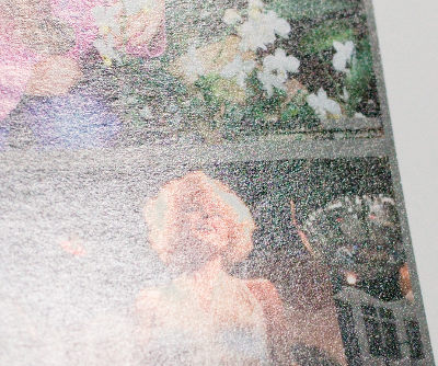
The look of a reflection off a semi-gloss paper (Ilford Galerie Gold Fibre Silk), note the gloss differential of the unprinted clipped highlights of the model's hair.
A perfectly lit wall-mounted print won't show any reflections, but when you handle a glossy print or display it under varying light you will now and then see the print at an angle and then reflection and texture will appear. Therefore I and many with me think this texture and the look of the reflection is an important property of the paper, in fact it's one of the key properties I look at when I evaluate a glossy paper. Just as it's a matter of taste what the "best look" is it's also a matter of taste how important this property is. The hand-feel is also such a thing, an archival print should ideally never be handled with bare hands and should be framed behind glass, and then the paper feel doesn't matter of course. When making casual prints or hand out material the paper feel can be an important part of making a high quality impression.
When you evaluate a glossy paper reflection you can look at the texture, how sharp the reflection is (ie how easy/hard it is to see through the reflection) and look for gloss differential around highlights, ie how the reflections differs depending on color or from the unprinted paper. In the past with older printers gloss differential could be a large issue as it could affect appearance also when looking at the print without any reflection, but today it's generally nothing to worry about other than how the print appears in a reflection. It should be noted than even the "bad" cases of gloss differential in inkjet prints today are generally much better than you find in high quality offset prints in books.
Example papers
At the time of writing I have tested and seen a number of papers but there are even more unseen, so this list here is just served as an example of some interesting papers. It's not at all a complete overview of the market.
Here's a few high-end semi-gloss papers you could look into:
- Ilford Galerie (Prestige) Gold Fibre Silk
- A well-established high-end semi-gloss paper, good as a reference to compare other papers to. A-cellulose, very fine surface texture, despite its "gold" name it's quite white for being an OBA-free paper. In later years "Prestige" has been added to the product name.
- Canson Infinity Baryta Photographique
- Highly similar to Gold Fibre Silk in paper feel, texture and reflection. It can be used as a drop in replacement and many have done exactly that as it's better priced.
- If I would recommend a paper without knowing anything about your personal taste, this would be it.
- Canson Infinity Platine Fibre Rag
- Cotton rag, with the coarser hand-feel that comes with that.
- Very similar in look to the Baryta Photographique, but a tiny bit coarser texture, and a little bit lower gloss-differential.
- The whitest OBA-free paper I have seen, however on the coated side the difference is not that big compared to the others. If you appreciate whiteness but don't want OBA you should test this paper.
- Could be seen as a higher end version of the Baryta Photographique, and the best Canson paper in this genre.
- Hahnemühle Photo Rag Baryta
- Cotton rag, OBA-free and the standard choice when it comes to Hahnemühle high end semi-gloss papers.
- Has a bit coarser texture and sharper reflection than the other mentioned papers. It's too coarse for my taste but I know others like this paper due to its texture.
- Hahnemühle Photo Rag Pearl
- Cotton rag, OBA-free.
- Softer texture and reflection than all other semi-gloss papers I've tested, despite that no compromise in gamut and dmax.
- Very slightly less white than most other papers in the genre. If you like a whiter paper there is the Fine Art Pearl.
- Very little gloss differential.
- At the time of writing this is my personal favorite.
- Hahnemühle Fine Art Pearl
- Same surface as the Photo Rag Pearl, but an a-cellulose paper and a "moderate" amount of OBA which leads to a visibly whiter paper.
- Has a similar hand-feel as a cotton paper despite that it is a-cellulose. The Photo Rag Pearl is still a bit heavier though.
- Epson Traditional Photo / Epson Exhibition Fiber
- Called Epson Exhibition Fiber in the US and Traditional Photo in EU.
- I have not yet personally tested this paper but I mention it because I know it's a good reference in terms of maxed out whiteness, gamut and dmax, so if you are interested in maximizing these aspects you should probably have a look. Naturally it has quite some OBA.
When it comes to matte papers I've concluded that I don't like the textured papers, the use case seems very narrow to me. If you make a very large print the texture will probably not be that disturbing but on a smaller print it does significantly affect the look of a photo, a smooth sky or smooth skin does not look so smooth any longer.
Therefore I've focused my search at the smooth matte papers and it can be a little bit harder to find OBA-free papers there. There is one though, Canson Infinity Rag Photographique (OBA-free cotton paper). Hahnemühle's corresponding paper Photo Rag is very well-regarded but does have a low amount of OBA, probably not a real issue but when I can get an equally good paper (and virtually the same whiteness) without OBA I prefer that, so the Canson is my choice for matte.
I don't have much personal interest in the high gloss look, I've
tested as much to see how it looks (it does look very much like those
lab C-prints) but I don't have any specific names to suggest at this
time.
Revision history
- May 2016 — modernized web page, cleanups.
- February 2015 — first published
Copyright © 2015 – 2016 — Anders Torger.