Display calibration and profiling with Argyll
This article will provide some background to screen calibration and profiling for photographers, and then show a detailed Argyll workflow of how to perform the task. The typical reason to use Argyll instead of software bundled with the measurement instrument is that you can get higher quality profiles, especially for consumer models where the instrument is often fine but the software simplistic.Today there is a well-known front-end to Argyll for display calibration, DisplayCAL (formely known as dispcalGUI). This article will be somewhat overlapping and my workflow will go directly on the Argyll command line tools, but since I've made all the decisions for you it may still be smoother to go this way.
If you're somewhat familiar with Argyll and want to get this done now, jump directly to the workflow summary.
Who needs to profile the display?
The typical use case for screen profiling is to be able to match prints with the screen. In this case you profile both the screen and the printer (with papers), and indeed you really must do that to get a good predictable match.However if you don't print and only view photos on screen and publish to the web, is it then worthwhile to profile? It depends. A wide gamut screen needs profiling otherwise it will present over-saturated images in various situations, but with a reasonable normal gamut screen you can do photo editing and publishing without images looking too off. For example if an image has a green cast you will see that green cast regardless if the screen is calibrated, profiled and color-managed or not. Actually, I think the largest problem with uncalibrated screens is not that their white points or hues are a bit off, but that they often exhibit black crushing which can make you brighten shadows more than you should when you edit photos.
Anyway if you're perfectionist you'd want to profile the screen even if not using a printer, but if you have a more relaxed view on color accuracy you don't need to worry as long as you get a normal gamut screen of good quality.
Today many screens have an "sRGB" setting and perhaps an "AdobeRGB" setting, these are meant to match those two common color spaces. However, in reality they are quite off as there is sample-to-sample variation from the factory so it's not something to be trusted in full. However, those settings are generally good enough for casual use.
It's worth mentioning that calibration and profiling is not about getting a screen perfectly spot on all colors as it's not really possible, it's rather about reducing errors. The difference between a "factory calibrated" and own custom-calibrated screen is still quite visible.
Properties of a display suitable for photo work
Today the primary property of a good photo screen is a wide viewing angle. Precise profiling is of no use if colors change when you move your head slightly. In the early days of LCDs there where many which had poor viewing angle and they are nearly unusable for photographic work. Today these are less common, but they still exist and should be avoided.While very deep blacks is attractive when you want to use the screen for watching movies, it can actually be a bit of a disadvantage in photo work, especially if you work with prints. A lower contrast screen is easier to work with when you match prints. I don't think you need to avoid screens with deep blacks (you can raise the black level in calibration if you'd like), but you should not see a weaker contrast ratio as a disadvantage either. Likewise if the screen is slow it can be an issue for gaming and movies, but not for photo work.
Uniform backlight is good to have, on the other hand my experience is that even if the screen is a little bit weaker in that area it does not lead to any significant issues, you don't really notice it. I think the slight change of color due to varying viewing angle (which at the time of writing is a problem with even the best screens) has a larger impact. If you just get a screen with reasonable uniformity it should be okay.
A major decision is if you should go for a wide gamut (usually close to AdobeRGB) or stay with a normal gamut (sRGB) screen. Wide gamut means that the screen can show more saturated colors than normal screens.
If you're not going to profile your screen I would strongly suggest to get a normal gamut screen or expect to run the wide gamut screen in its sRGB mode (most wide gamut screens has that), as wide gamut is still a mess if you don't have full color management.
It's a common misconception that when you calibrate your screen you can make it perfectly match say sRGB or AdobeRGB and thus get a very well-defined behavior and not really need color managed-applications (or OS). In reality the screen's gamut will stay roughly the same after a calibration, so to get accurate colors the OS / applications need to relate to that.
At the time of writing (2017) when you run Linux or Windows only color managed applications will understand that the screen is wide gamut, meaning that all other applications will show over-saturated colors. Mac OS X has color management built in so all non-CM apps will show sRGB colors automatically. That is, a wide gamut screen may cause some irritation on Linux and Windows while it's better managed on OS X (assuming you profile the screen of course).
If you only publish images with sRGB color space or don't use highly saturated colors that often you won't suffer from having a normal gamut screen. However I personally prefer to have a screen that has some margin towards the printer and is rarely out-saturated by the camera, and I can live with the drawback of some applications being too saturated, so my choice is wide gamut. If you're using OS X it's a no-brainer thanks to that the color-managed OS takes away the saturation problem of the non-CM apps. On Linux and Windows you may want to run Firefox instead of some other web browsers (as Firefox supports CM) and make some other specific application choices to go with your wide gamut screen. I would be surprised though if Windows does not take the step to become fully color-managed like OS X soon. Linux is also making progress.
Today there are 6 bit (not many left I hope!), 8 bit and 10 bit panels. This means that they have 64, 256 or 1024 steps from darkest to brightest color. I think most higher end screens are 10 bit today, but should you get an 8 bit screen they are still adequate for photographic work, if you just follow the workflow and calibrate properly it will not be a problem. Forget 6 bit screens. When you color manage a screen some of the available steps gets eaten up, and 6 bits is just too little, there is a high risk of banding problems.
Colorimeters vs spectrophotometers
Spectrophotometers (spectrometers) measure the actual light spectrum segmented into small bands, while colorimeters have three filtered RGB channels. The latter are cheaper and simpler instruments but will provide very good results if they're been tuned against the screen's RGB channels.If you have a colorimeter which is matched for your screen, you can go ahead and use it without worries with this workflow. If you however have a new screen with a different gamut (say your old was an sRGB screen and the new is wide-gamut AdobeRGB) you need to adjust your colorimeter for the new gamut, and for this you need a spectrometer or a correction file. You can read more about this at the ArgyllCMS site on the page about wide gamut displays and colorimeters.
If you have not yet bought an instrument and wonder if you are going to get a spectrometer or a colorimeter I strongly recommend to get a spectrometer as these never have problems regardless of screen gamut, and they are also more exact in an absolute sense (less variation between instruments). You can also use them for printer profiling, which can come in handy later even if you don't have a printer today. Buying an instrument together with friends and split the cost can also be a solution as you may only need it once a year or so.
Colorimeters are not all bad though, when it comes to measuring very high contrast screens (dark blacks) they are generally less noisy and they have less problems with drifting as the instrument becomes heated by the screen, so some users actually have both type of instruments. I think that is overkill though, with Argyll spectrometers perform well as you simply increase the measurement time to battle noise.
The difference between calibration and profiling
In daily speak we often say "screen calibration" and then think about the whole task that lead up to the ICC profile we use to color manage our screen. However strictly speaking we are doing both "calibration" and "profiling".Calibration means that you adjust screen settings to achieve a specific brightness and color temperature (white point), plus that calibration curves is applied for each color channel directly on the video card so that the screen gets a nice smooth behavior from dark to bright colors.
The second step is measuring the behavior of the calibrated screen to see how saturated colors it can produce and the exact response of each color channel. This is profiling, and this information is also stored in the resulting ICC profile. The profiling information is used by color management-aware applications so they can present images on the screen just as intended.
In theory you could actually skip the the calibration step and just profile the screen's behavior as-is (as you do when you profile cameras, scanners etc), however the tradition since the CRT days has always been to calibrate first so the color managed applications see an as well-behaved device as possible and there are reasons to to stay with that. That the video card calibration can have higher precision than the color management pipeline is one good reason.
When calibrating there's been some debate if you should calibrate towards the screen's native temperature (often higher than the standard 6500K) or go for 6500K, and if you should go for the screen's native gamma or set the typical 2.2. The reason to use the screen's native values is to minimize the required corrections and thus maximize the precision of the often 8 bit LCD panels. I think that a proper 6500K temperature is a key property of a display used for photo so I don't want to compromise that, however the gamma has less impact and may/might also be adjusted by the color managed application so I think that can be left at its native value.
At the time of writing 10 bit panels are more common which means that precision loss in the calibration step is less of a worry, so possibly the calibration and profiling workflow will be somewhat simplified later on when these screens are ubiquitous. For now I present a workflow which is good for both 8 bit and 10 bit screens.
Display calibration and profiling Argyll workflow
Here I assume you have ArgyllCMS already installed and working with your operating system. It's free and open-source and exists for Linux, OS X and Windows. It can be a bit messy to install on Windows and Mac OS X, but if you just carefully follow the installation instructions available on the Argyll web site you should be fine. Argyll is a collection of command line programs which are very flexible and capable of high end results but is a bit difficult to use for a beginner. With a tutorial like this it's quite easy to get through though.This tutorial has some special notes for the Colormunki spectrometer instrument but you can use the same workflow with any other.
Commercial screen calibration workflows are usually quite quick, you calibrate your screen in say 10 minutes or so. This workflow is much higher precision (a bit overkill even), and takes a long time to run trough waiting for measurements to complete. As modern screens doesn't need recalibration very often I've opted for this high precision but longer time workflow. The intention of the workflow is to really maximize what the instrument and screen can do.
The total time to get through this workflow is about 2 hours, of which 10-20 minutes is active work, the rest is waiting for measurements and profile generation to complete.
1. Create a work directory where all Argyll files will be. It's used again if you do a re-calibration later on, so put it in some good place. All Argyll commands is run in this directory.
2. If the screen was recently turned on, let it reach working temperature and stay there for a while, as the screen's backlight can drift a little during the first time after powered on. The light in the room can be as usual and also your desktop background, it will not affect the measurement in any significant way.
Note for (Colormunki) spectrometer users: let the instrument rest on the screen so it too becomes warm, as the measurement values can drift until the temperature has stabilized. 10-15 minutes should be enough.
3. Reset the screen to neutral settings for contrast and any other settings that might apply (typically a factory reset will do).
4. By using the screen's settings, tune the white-point to 6500K D65 and brightness 100 cd/m2. Use the instrument and dispcal to track changes in brightness and temperature as you change settings:
dispcal -H -t 6500 -b 100 dummy
- Option: brightness 80 - 120 cd/m2, recommended 100 cd/m2.
- Option: leave at native white point or 6500K or 5000K,
recommended 6500K.
- Some print makers prefer 5000K for "better" print matching, but I and many (probably most) with me prefer 6500K even when matching prints viewed under 5000K. This is because the eye does not adapt as well to the peaky spectrum from a screen so 6500K will look about the same as 5000K on paper, while 5000K on screen will look overly yellow. It may vary depending on your exact viewing conditions though, so feel free to experiment.
- Option: daylight version (D65) or blackbody version of
the 6500K white point, recommended D65.
-
There is about 3-4 delta E between D65 and blackbody 6500K, such a
small difference in white point has no real meaning so many
use D65 and 6500K interchangeably.
- Option: if the screen has a gamma setting adjust it to 2.4 if you have a dimmer work environment or 2.2 if you have a normal/brighter. Recommendation: keep at factory default setting.
Note for Colormunki spectrometer users: when Argyll says "Set instrument sensor to calibration position" after startup it means that you should set the Colormunki instrument in its self-calibration mode, which it will ask you to do each time you start dispcal.
While 6500K/D65 is a very strong de-facto standard for photo editing, there are different tastes concerning the brightness, the typical range is in 80 - 120 cd/m2. Note that this brightness range is considerably lower than screens are set at per default, and when reducing brightness this much it may look dull at first. The factory setting is usually one to impress in the store, and to work in a bright office environment. At a photo workstation it's better with a lower brightness especially if you work with prints as papers are low contrast compared to screens. A lower brightness reduces the risk of fatigue too. However if you do sit in a bright office environment and you only intend to watch photos on screen and not match with printed paper, you may go for a considerable brighter setting, such as 200 cd/m2.
If you want a different brightness than the suggested 100 cd/m2, adjust the "-b" parameter. Oh well, you actually don't need to specify it as it won't affect anything except for the shown "target brightness" number.
When dispcal is started jump directly to "2) White point (Color temperature, R,G,B,Gain/Contrast)". Use the screen's brightness and RGB settings to get to the target. You usually don't need to touch the contrast setting, the RGB channel settings works as contrast per color. Example output:
     Adjust R,G & B gain to get target x,y. Press space when done.
        Target Br 100.00, x 0.3128 , y 0.3291
      \ Current Br 103.49, x 0.3148-, y 0.3295-  DE  1.4  R-- G+  B-
The deviation is measured in Delta E, DE (1.4 in the example). It may
be difficult to get below 1.0, but as the absolute precision of the
instrument is usually not better than about 2 - 3 for typical
spectrometers and even worse for colorimeters (that is compared
to an absolute reference, the instrument's repeatability is usually
below 1) there's no big deal to be a little bit off. In addition the
eye adapts to a white point very well so don't work too hard to get a
low Delta E. I'd say getting it below 3 is perfectly okay. It can be
fun to try getting spot on of course, but it's probably more important
to minimize the attenuation of the RGB channels, especially if you
have an 8 bit panel.
To find the RGB settings that work the best can be quite difficult. Start from the neutral setting and adjust by lowering the values from there. If that doesn't work you can try to lower all equally a bit down and increase from there. The goal is to reach the whitepoint with as little attenuation of the RGB channels as possible (preferably leaving one channel at it's neutral setting) and control brightness through the brightness control.
"R-- G+ B-" is Argyll's leads for how to adjust the gains, in this example R should be reduced the most. Those guides are not always that helpful though.
Note that you may skip white point tuning using screen settings all-together if you want to, this can be adjusted via the profile instead. If so you only need to adjust the brightness. With 8 bit panels it may actually be a slight advantage to do it like that (for the same reason we choose native gamma calibration in the next step). I started out with that calibration workflow but over the years I've noted that most prefer to have the screen tuned to 6500K via its settings so it "looks sane" even without the ICC profile loaded so I've changed the recommendation to this (I prefer that myself too). With 10 bit screens there may even be an advantage to adjust RGB channels via settings rather than the ICC profile.
If your screen supports DDC you can adjust the settings via DDC software which may be easier than using the OSD of the screen. In Linux you can run "gddccontrol".
Example: this was the best possible setting I could get on my old trusty Dell 2408-WFP:
\ Current Br 106.89, x 0.3111+, y 0.3277+ DE 0.9 R++ G+ B-
Neutral setting on this screen is 50/100 contrast/brightness and RGB
100/100/100. After adjustment RGB was 100/94/99 and brightness at
0. Note that even with the lowest brightness setting I could not
reach down to 100 cd/m2, which is not unusual. Screens are often made
unnecessarily bright for photo work.
Note that the brightness can affect the RGB settings somewhat, so it's good to start out with a rough brightness setting. Of course, RGB settings will also adjust brightness. The DE value shown excludes the brightness, it's only for the 6500K XY coordinate, and indeed you don't need to be as exact on brightness as with white point temperature.
When complete with the screen's settings, quit dispcal.
5. Measure the screen's native gamma using Argyll:
dispcal -v -RThe measurements will take about 2 minutes.
- Option: skip this step and use a gamma of your choice (fixed 2.4
or 2.2, or calculated from ambient measurement), recommended -- use
native gamma.
- exception: if native gamma is extreme (highly unlikely) use gamma 2.4 or 2.2 whatever is closest.
The reason we measure the screen's native gamma is that we want to calibrate towards that, and the reason we do that is to minimize the corrections we do. The more we force the screen to become something it's not, the more of its dynamic range we lose and we can get issues with banding.
What the native gamma is not that important, it will most likely be somewhere close to the 2.2-2.4 range. The profiling information we add later on will describe what gamma the screen has so color managed applications can relate to that, and what they usually do is nothing(? too be verified!) as it deviates so little from what the viewing environment would prescribe. In theory you should have a higher gamma if you work in a dimmer environment and a lower in a bright but the adjustments for any normal photo workstation environment would be so small that I think it's better to keep to a native gamma.
If you're new to the gamma term and want to know more you can read more about it in the gamma section.
6. Start dispcal, white-point D65 and native gamma as target:
dispcal -v -H -o -t 6500 -g <measured_aprox_gamma> <filename_prefix>
- Option: if using an spectrometer add "-Ibw" which compensates for instrument drift but prolongs measurement times. Recommendation: skip if the instrument has been warmed up on screen, otherwise include.
Just for reference, the following text menu is shown:
  1) Black level (CRT: Offset/Brightness)
  2) White point (Color temperature, R,G,B, Gain/Contrast)
  3) White level (CRT: Gain/Contrast, LCD: Brightness/Backlight)
  4) Black point (R,G,B, Offset/Brightness)
  5) Check all
  6) Measure and set ambient for viewing condition adjustment
  7) Continue on to calibration
  8) Exit
We will actually jump straight to calibration at this stage. Argyll is a flexible software that supports many new and old devices which make it a bit more complex to navigate. That's why I wrote this tutorial.
7. Run the calibration (menu option 7). It will run automatically and it will take about 50 minutes. Many patches are measured and it spends very long time to measure the dark patches to minimize issues with instrument noise. I suggest setting an alarm clock and go do something else while waiting.
The screen settings we did in the earlier steps should mean that Argyll won't need to adjust that much to match the target.
8. Look at the calibration curves to see if they are sane. If you have a good screen it's very likely that they are so you can skip this point if you like.
The curves are in the file <filename_prefix>.cal in the group with four columns of numbers, the first is just x=y and the following are the RGB columns we want to look at that they are reasonably close to x=y (ie first column). If so we have got a good gamma approximation so the screen does not need too strong correction. Instead of plotting those curves from the .cal text file you can look at <filename_prefix>.icc in an ICC profile viewer and the vcgt tag there which contains the same curves.
Note that it's not unusual that the curves do not start at zero, that is because many screens have a "flat response" in the start ("black crushing"), that is the first near-black colors are crushed to black. Another reason is that the black point color needs to be adjusted to match the white-point so it may need to add in some extra red for example (quite likely it's red as most screens have higher native temperatures than 6500K).
If you have a screen with extremely good contrast ratio (very dark blacks) it may be the case that the instrument is not capable to measure them properly and that would lead to the same effect. The only solution to that problem is to hand-edit the curves in the .cal file. I don't know how common that problem is though (I have never run in to it at the time of writing).
If you as recommended chose to adjust the white point via the screen settings the curves should end close to the max value 255. If you instead let the calibration take care of it the adjustment will take place here and thus one or two of the curves may be some distance away from 255 at their max.
Note that the ICC profile which now has been produced is not the finished result. The calibration with its curves are finished, but the profiling information is not there yet so the ICC profile is not ready to use. That is, calibration will cause the screen to meet the temperature and gamma target we set, but a color managed application needs to know exactly how the screen behaves after calibration, that's why we need to profile it in the following step.
Anyway, as the calibration curves are finished you can test-load it with
dispwin -I <filename_prefix>.iccto see the result became. Unload with "dispwin -c". If you have a high quality screen whose screen settings were adjusted to be close to target before we ran calibration it can be hard to note any difference.
If calibration has changed white-point drastically from the screen setting it will be easy to see of course.
If you have a lower quality screen there's a risk that the screen gets a very low contrast due to strong calibration curves. If so you could change the calibration target temperature to something closer to native (and redo screen settings too for that) and start over.
9. Generate test color patches for the profiling step:
targen -v -g33 -d3 <filename_prefix>
This will make 836 patches, which probably is a bit overkill. However I profile the screen so rarely and it's done in automatically so I have not cared to find out a suitable trimmed down set.
10. Profile the calibrated screen:
dispread -v -H -k <filename_prefix>.cal <filename_prefix>
This will take about 45 minutes.
11. Generate the final ICC profile from the profiling results:
colprof -v -qh -as -nc <filename_prefix>
It takes 1-2 minutes for Argyll to generate the profile.
This will create a simpler type of profile which describes the calibrated screen behavior with one curve per color channel and a XYZ colorant (ie "how red" maximum red is etc). This may sound simplistic, but a display is such a well-behaved device that it should be possible to describe it this way with high accuracy.
It is possible to make 3D LUT profiles like you do for printers (replace -as with -ax), but the risk of nasty non-linear effects is there and the gain is very little, and the compatibility is still a bit weak. In the future when 10+ bits can be guaranteed through the whole color management chain it may be the better choice though for that little extra in accuracy.
Laymen often do the mistake to strive for the lowest possible Delta E numbers like some sort of sport, and forget that smoothness is also an important factor and that too aggressive correction can affect that negatively so that you risk banding and strange color transitions in gradient skies for example.
It also often the case that the basic profile will perform within 0.5 Delta E from the LUT profile for the worst patch.
12. The ICC profile <filename_prefix>.icc is ready to use. Install it according to your operating system's procedures. You can use Argyll's dispwin -I <filename_prefix>.icc for installation, see the linked documentation of how it works for your OS.
Depending on your platform the individual color management aware software applications may need to be configured with the profile. At the time of writing OS X distributes it automatically while it can be more dodgy on Linux and Windows.
13. Create a text file and write down the screen settings used for the calibration. If you would accidentally change or reset the screen settings, it can be nice to be able to retrieve them.
Workflow summary
Getting through the workflow takes about 2 hours, mostly waiting for long-running measurements to complete.- Start condition: the screen should have been on for at least 10 minutes, and the instrument should have been hanging on the screen for at least 10 minutes.
- dispcal -H -t 6500 -b 100 dummy -- manually tune to match D65 and 100 cd/m2 using the screen's settings.
- dispcal -v -R -- measure the native gamma (2 minutes runtime)
- dispcal -v -H -o -t 6500 -g <measured_aprox_gamma> <filename_prefix> -- calibrate (50 minutes runtime).
- targen -v -g33 -d3 <filename_prefix> -- generate profiling test target.
- dispread -v -H -k <filename_prefix>.cal <filename_prefix> -- profile (45 minutes runtime).
- colprof -v -qh -as -nc <filename_prefix> -- generate final ICC profile (2 minutes runtime).
- Alternative: colprof -v -qh -ax -nc <filename_prefix> -- LUT ICC profile (4 minutes runtime).
- profcheck -v2 -k <filename_prefix>.ti3 <filename_prefix>.icc | sort -- optional DE2000 check.
- dispwin -I <filename_prefix>.icc -- install profile
Evaluation and maintenance
Note that some color managed applications may need to be restarted before an updated ICC profile takes effect.If you want to evaluate the screen performance with your eyes you can do so on a web page with test images, for example this LCD test. Particularly interesting is to look at gradients. It's normal that calibration leads to some slight banding, but that is generally no issue in photographic work.
If you want to check how much the generated ICC profile deviates from the measured patches you run:
profcheck -v2 -k <filename_prefix>.ti3 <filename_prefix>.iccYou might think that the delta E values would be 0 here, but as the profile generation will take measurement noise and smoothness into account it won't be. The profiling model can also limit how well it can match.
If you later on want to re-calibrate with the same settings you just run:
dispcal -v -u -o <filename_prefix>
How often do you need to re-calibrate?
In the CRT days in professional studios it happened that screens where calibrated on a daily basis. Today's flat screens are much more stable. At the time of writing I've had a wide gamut LCD screen for more than six years, and looking back at old calibration files I can see that it has drifted about 2-3 delta E in those years.In practice this means you can probably use your screen for several years without worrying about any significant drift. If you have easy access to the calibration instrument I'd re-calibrate once a year, but if you need to rent of borrow one I think one shouldn't need to worry if one let a few years pass. Those that sell color management gear unsurprisingly tend to exaggerate the need of frequent re-calibrations.
Multi-screen calibration
If you have multiple screens on your desktop you probably want to calibrate them all to look the same. It's of course best to have the same screen model, but in reality the secondary screen can be your old screen and thus a different model. You will then typically need to adjust the black level in addition to the white level and temperature in the calibration step to make them match.If the screens are vastly different you cannot expect to make them match perfectly in look, for example if the panel types differ or one screen is glossy and the other matte; there's more to screen appearance than colors.
The Argyll tools support multi-screen setups, you will need to add the "-d<display index>" parameter to dispcal and dispread to select which screen to calibrate.
What is gamma?
The eye responds to light exponentially, that is it's more sensitive to small differences in brightness among dark colors than among bright. Image encoding and reproduction systems adapt to that by encoding and decoding signals with an exponential function y=x^gamma.On the encoding side we find the 8 bit jpeg format for example. If it would encode light linearly with the 256 steps the shadow detail would look dreadful and the highlights graded in unnecessarily small steps. Instead it's encoded exponentially "with a gamma", 0.45 in this case, that is y=x^0.45.
However if that exponential signal would be shown on screen in a linear fashion it would look overly bright, so the screen need to apply the opposite gamma 1/0.45 = 2.2. So if we multiply gammas from the original scene to the screen we get 0.45 * 2.2 = 1.0, that is the shades will be seen in the same relation as in the original scene.
The resulting gamma from original scene to viewer is called "viewing gamma". In a normal bright viewing environment you want it to be 1.0, but for example in a cinema environment where you have a pitch black room with a bright screen the eye-brain's perception of contrast will change (it will look lower) then the viewing gamma is set to 1.5 to compensate. In a dimmer workplace you land at 1.1, and thus depending on how bright your environment is where you have your photo workstation a 2.2 or 2.4 gamma may be the most suitable (that is having a 1.0 or 1.1 viewing gamma).
Having 1.1 or 1.0 does not matter that much though, and if you like me have a workplace with varying light over the day, just leaving the screen at its native gamma (usually somewhere in the range 2.2-2.4) will be fine.
Notes about the Colormunki Photo/Design instrument
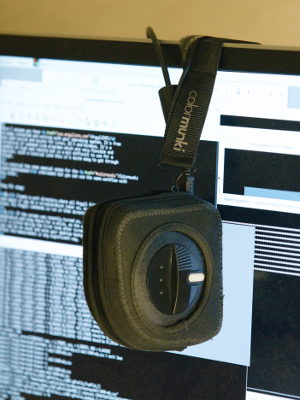
|
| Colormunki Photo spectrometer hanging over a screen for calibration and profiling. |
If you own the Colormunki instrument I assume you are already familiar with how it works, but if you've borrowed it from a friend and have never used it before here are some quick facts:
- It's a an economical spectrophotometer, ie it can be used for printer profiling and other color management tasks in addition to screen calibration.
- It has a built-in calibration lamp which is used during startup to calibrate the instrument, and also when scanning patches for printer/paper profiling
- The button is used during spot measurements and printer calibration, it has no use during screen calibration.
- The measurement head can be turned to four different positions - 1) measure the surface (screen/prints), 2) internal calibration, 3) measure projectors, 4) measure ambient light. It may be a little difficult to get a grip and turn the head. When doing screen calibration you only use position 2 for an initial calibration when the software asks for it, then you set it to position 1. The head's position is shown with the white dash on the side of the instrument.
- The pocket with the weighted strap is used to hang the instrument over the screen so the measurement head can rest on the screen surface. You may need to open the zipper a bit to find the right balance so the instrument is really towards the screen surface. Remember to open the hatch in the bottom so the measurement head actually sees the screen.
- Argyll's Colormunki driver can be a bit dodgy, and the USB connection in the instrument too. Try remove and reinsert the cable if you get problems with contact.
- When you measure a screen the instrument should be fully warmed up by the screen to stabilize measurements, so leave it on the screen for 10-20 minutes before starting your measurements.
- Measurements of dark colors is a bit noisy, but Argyll can compensate for that by measuring for longer time and averaging.